In a prior blog post, I discussed how to create graphs and maps that stand out to audiences you need to reach, such as elected officials. But knowing the how is one thing; understanding the why helps encourage creation of data summaries purpose-built for your audiences’ needs.
In a July 2019 opinion piece in the New York Times, entitled “Health Facts Are not Enough. Should Persuasion Become a Priority?,” pediatrician and AcademyHealth member Aaron Caroll makes an important observation:
“The public may not process information in the same way [scientists] do… It seems important to engage the public more, and earn their trust through continued, more personal interaction. Dropping knowledge from on high — which is still the modus operandi for most scientists — doesn’t work.”
Facts are not enough. I find in my data storytelling consultancy, where I work with social sector organizations to get their data used for impact, I lean more heavily these days on the tools of storytelling than data (though it’s still vital to mix the two together on the same canvas).
The Data Conundrum in Academia
Researchers are trained to lay out the evidence – all of it – and to note caveats and not to create a storyline. In the previous post I note one approach for presenting findings as an ever-lengthening series of summaries. That tactic will help you bridge this disconnect between your desire to summarize everything and your reader’s likely need to get to the point quickly.
But why do we even need to bother with efficient data presentation? Can’t audiences learn to devour all the details? I think you probably know that the answer to that question is “no,” assuming you want impact from what you present.
You see, it all comes down to how we process information. Most everyone you need to reach are generalists, or perhaps specialists in another field. They haven’t spent years studying the same academic discipline. If you’re fortunate, they may have taken one class in college on the topic on which you spend your professional life. So saying more – that is laying out all your facts – won’t support your case. People will just stop listening.
Data Are Not The Universal Language—Stories Are
To engage your audiences, you need to find the right trigger. Beyond the issue of how much to say, data, it turns out, is far from a universal language. There are probably evolutionary reasons for this. Society doesn’t mandate a need to understand abstractions like rates or to know what large numbers, like millions, look like. In addition, many have an aversion to numbers, so they tune out when they see data, whether presented visually or otherwise.

Stories, on the other hand, are universal. Sure, some people may say that they’re bad at telling or writing stories, but seemingly everyone is good at listening to stories. There’s a reason for that. When we hear a story, not only are the language processing parts of our brain activated, so, too, are those areas in our brain related to the experience being shared. A story puts our whole brain to work, which makes us more likely to be attuned and to take action as a result.
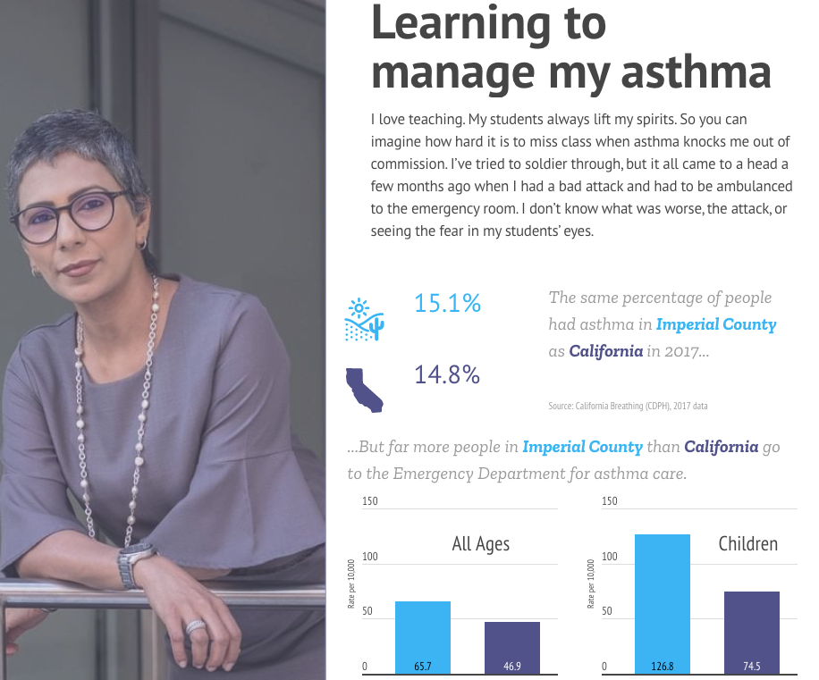
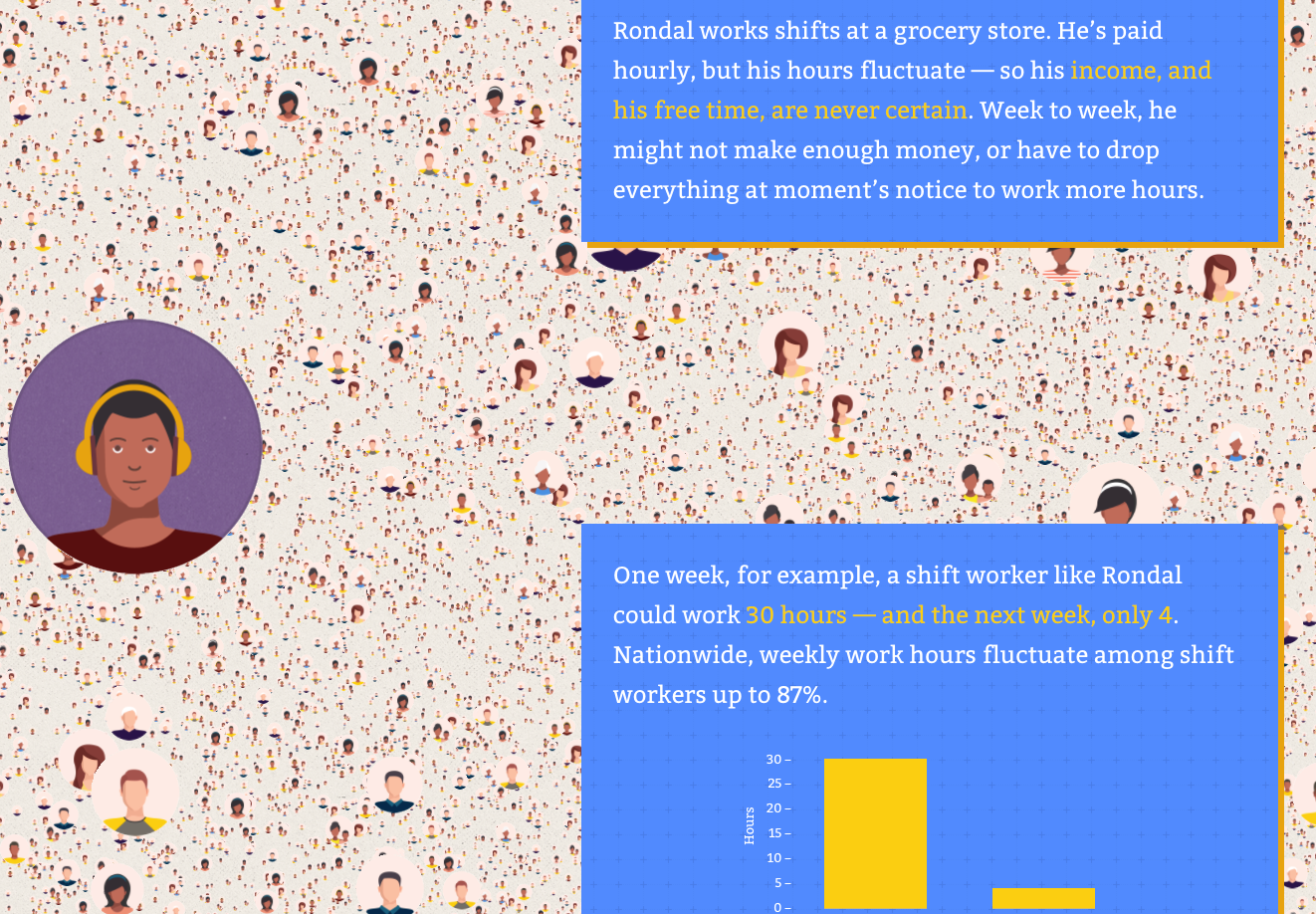
So while you may think that it cheapens your findings to add “color” (e.g., weaving in a story about an individual or an experience that relates), you’re actually doing your data a great service. You’re providing a useful means to translate findings into a language all can understand. As a result, you’ll present information in ways that are more likely to pierce people’s information shields and prime them to take action – support a policy, donate to a cause, or even just share findings with other stakeholders.
And you can start small, building your data storytelling chops as you go. You can begin, for example, by taking the time to create graphs that are clearer via annotations that help unpack your findings. Or you can share a graph you built over coffee with a person you need to reach, and ask them whether you’re presenting your data in a cogent and effective way. Hearing their input will no doubt help sharpen your data communication muscle.

Over time, you can weave in some stories. When you verbally present findings, for example, you can begin by sharing a story about an individual whose experience relates. Just a few sentences may suffice before presenting the data results. Before you know it, you’ll be well on your way to find tactics that work for you – and, importantly, your audiences – to transform numbers into impact, through effective presentation formats.