You probably knew that the prices private health insurers pay hospitals are higher than those of Medicare and Medicaid. But you may not have known that the gap between private and public payers used to be a lot smaller and has grown tremendously in recent years.
That's clear from the work of Thomas Selden and colleagues, which can be summarized with this one chart (their Exhibit 1):
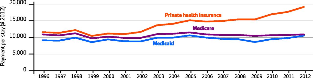
Using Medical Expenditure Panel Survey (MEPS) data, by payer (private health insurance, Medicare, and Medicaid) and over time (1996-2012), the chart shows average hospital payment rates (in constant dollars), adjusted for age, sex, race/ethnicity, geography, income, health conditions, charges, length-of-stay, and whether or not a surgical procedure was performed. To produce figures for the chart, the authors used this model to predict hospital payment per stay for each MEPS observation, as if they were covered by private insurance, Medicare, or Medicaid, in turn.
As is clear from the chart, adjusted, average private pay rates have always been above public rates, but were closest in 1996-2000. Back then, private rates were no more than 10% above Medicare rates. Perhaps this was the effect of managed care, which kept growth in private rates down. Those rates began to grow during the managed care backlash, until 2005. From 2005-2009, adjusted, average private hospital rates—while considerably above Medicare and Medicaid rates—held steady. Then, in 2009, they took off again. In 2012, adjusted, average private rates were about 75% higher than Medicare rates.*
Medicaid payments were about 90% of Medicare's in most study years.
The chart begs the question, why did private pay rates are diverge so sharply from public ones in recent years? The authors suggest several possibilities, including:
- Perhaps shortfalls from public payers are made up with higher private prices, aka cost shifting. Based on the literature, we can reject this hypothesis.
- Perhaps hospitals have been exploiting growing market power, driven in part by greater market concentration through horizontal and vertical integration. This is a reasonable hypothesis, with support in the literature.
- Perhaps compositional changes make a contribution. The authors note that private inpatient hospital stays declined from 13.6 million stays in 2008 to 11.2 million in 2012. Even controlling for age, health conditions, receipt of a surgical procedure, etc., perhaps it's the case that less complex and cheaper cases shifted to the outpatient setting (where they are handled more cheaply), leaving behind more complex and costly cases in the inpatient setting, driving up average prices. For this to contribute to the chart's trends, it'd have to disproportionately affecting privately insured patients, relative to Medicare and Medicaid ones. It's possible.
The authors ask, "[W]hat are the impacts of the growing differential on consumers?" On one hand, growth in coverage rates and out-of-pocket limits helps cushion consumers from increasing hospital prices. On the other, growing prices coupled with the trend toward higher deductibles may exert financial strain on some consumers. For just this reason, some hospitals are beginning to look more closely at their rates. As more people pay more out-of-pocket, hospitals may need to justify their prices not just to insurers, but to their patients.
* One limitation: MEPS data lack Medicare capital pass-through payments, payments for graduate medical, and supplemental Medicaid payments.