
It is no longer enough to be able to conduct rigorous research. You must be able to communicate results to relevant audiences. Data visualization is a key strategy in achieving this, but only when it’s done well. I know from personal experience because the HSRProj team recently worked with a large dataset to create a user-friendly dashboard. I learned a lot through the process and I’m sure many other health services researchers are struggling to use data visualization effectively so I’m outlining some of my lessons learned below.
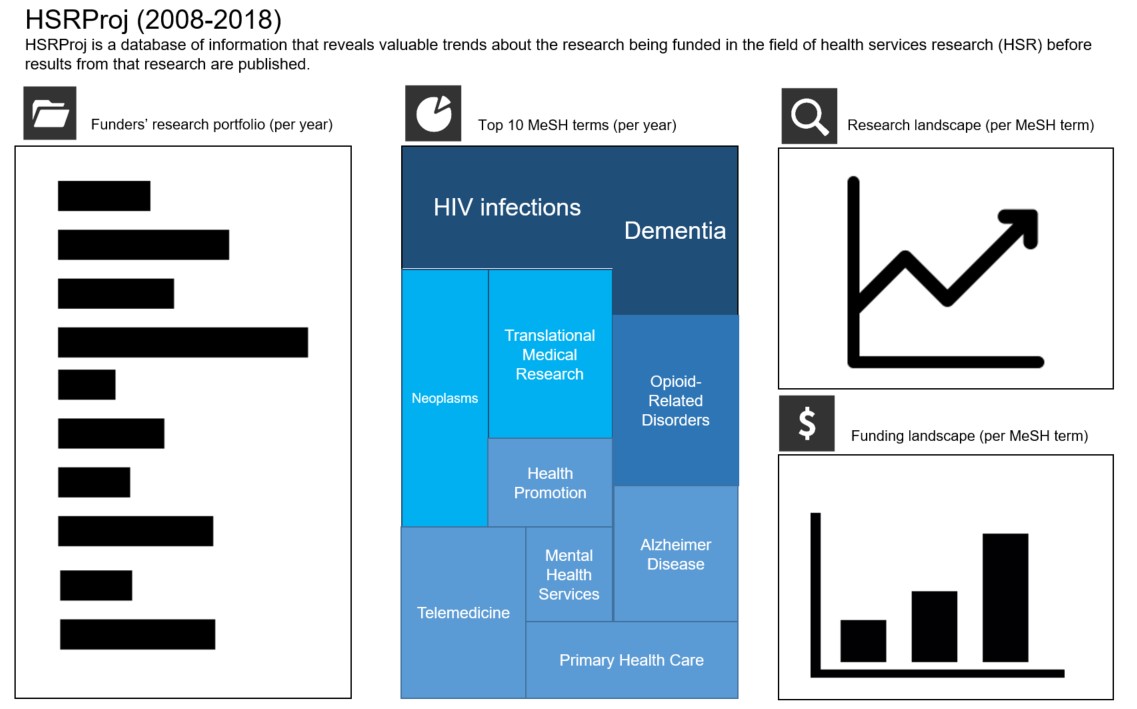
At AcademyHealth, I help manage a database of information on ongoing, funded health research projects called HSRProj. This is a valuable resource for funders to find underfunded areas of research, or organizations to develop strategic agendas based on research trends. However, as HSRProj continues to grow, with over 37,000 projects, 370 funders, and 2,400 MeSH terms, it is difficult to comprehend what all its data means. The challenge for our team was to convey the value of HSRProj data in an easy way.
Determine your audience and figure out what information they want to see
In order to determine the types of trends to visualize, the HSRProj team spoke with potential users of HSRProj and identified the following user goals:
- Funders want to analyze other funders’ portfolios and stay informed on research and funding trends
- Researchers and students want to enhance their literature reviews, understand research trends and gaps, and see which funders might be good targets for their work
- Policymakers want to find topic trends among researchers or funders who could help study policy questions
By understanding what information your audience needs, you will have a better understanding of both the types of visualizations you will want to create and which variables you will need to pull in to create those visualizations. While there are no definitive rules to data visualization, there are parameters that make data visualizations straightforward. For example, trends may be the most important relationship for users to see as they indicate how a field is changing and guide decision-making. Because time is a continuous variable it is often clearer to represent that continuity through a line graph rather than a bar graph.
Get to know your dataset and pull necessary variables
If you don’t understand the intricacies of the dataset you’re working with, you will have trouble explaining it visually to others. Seems obvious, but since I did not create the original HSRProj dataset, I found that it was incredibly important to allow time for myself to dig into it myself.
I downloaded the entire HSRProj database, converted the XML file into an Access database, and looked at the variation of the data for the major categories: major Medical Subject Headings (MeSH), supporting agency, funding year, funding amount, initial year, final year, and country. MeSH is the U.S. National Library of Medicine’s hierarchical, structured vocabulary for indexing and cataloging biomedical information. Major MeSH terms were used to represent research areas in the figures. From there, I grouped the variables in the following order to present the patterns in the data.
- Funding trends of major MeSH terms over time, and funders’ research portfolio (within each supporting agency, by major MeSH term, the total funding amount of unique projects over funding year)
- Research trends (within each major MeSH term, total number of unique projects over the projects’ duration)
- Research priorities each year based on top 10 MeSH terms for the year when each project began
- Where research is being conducted (number of unique projects per country)
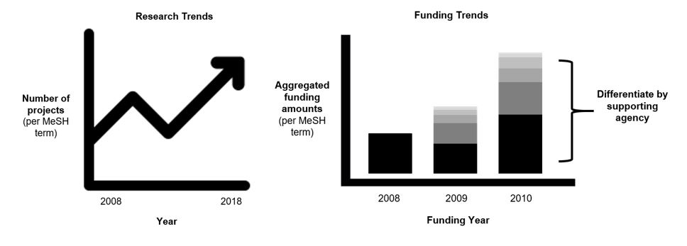
Once I understood the combination of variables to show each trend, it was easy to build the crude figures such as the ones below.
From these simple figures, I then assigned variables to serve as Tableau filters to present a subset of the data. Filters provide users with the flexibility to explore different trends within one figure without overwhelming its display. For example, a user could use the MeSH term filter and choose the “Opioid-Related Disorders” MeSH term to see what supporting agencies are funding work in that specific research area, and the amount of funding awarded over time.
Double-check your work and tools
Tools can’t read your mind and may have built in bugs and biases. Similar to a logic error, the Tableau software did not produce an error or stop me when I mistakenly used the initial year variable instead of the funding year variable in the funding and research graphs. Make sure there are ways to double-check your work. I made several tables in Excel that summarized the information from the original dataset to check that the numbers displayed in figures were accurate and sought feedback from others. This process helped me catch my technical mistakes and help me troubleshoot the figures.
Map out your dashboard and gather feedback
Success is when people with limited knowledge of your dataset can understand your figures. After creating your figures, it is good practice to solicit feedback from people with diverse experiences. Creating a clear graph is one thing, but arranging the figures into an engaging and understandable dashboard is another challenge. It is helpful to map out your figures and other relevant sections of your dashboard. I created a mockup in PowerPoint to gather professional feedback from the AcademyHealth communications team on design elements that would improve the display of the dashboard (see figure below).
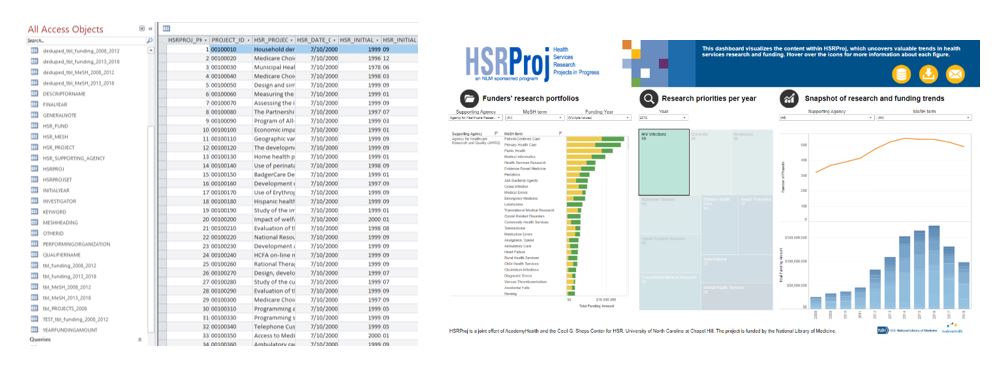
Through this process, I started with a database (seen below on left) and ended up with the visuals and dashboard on the right.
As a final thought, I learned that visuals often look worse before they look better and sometimes it is easier to start over when you update your datasets rather than trying to fix your visuals. Data visualization takes patience and is an iterative process, but by the end of it, you will reap the reward of enhancing the impact of your work.
The annual HSRProj Research Competition for Students launches on January 13, 2020. For more information about the competition and eligibility criteria, please email hsrproj@academyhealth.org.
HSRProj is a joint effort of AcademyHealth and the Cecil G. Sheps Center for Health Services Research, University of North Carolina at Chapel Hill (UNC-CH). It is funded by the U.S. National Library of Medicine (NLM), Department of Health and Human Services. The National Information Center on Health Services Research and Health Care Technology (NICHSR) coordinates its continued development for the National Library of Medicine (NLM).
The work presented in the blog is possible with funding from the NLM and support from UNC-CH. Additionally, several AcademyHealth team members supported the development of the blog, including AcademyHealth HSRProj team members Margo Edmunds (HSRProj Principal Investigator) and Nisha Kanani (HSRProj Program Manager).